Client
Pomegranate Media

Pomegranate Media
7 hours
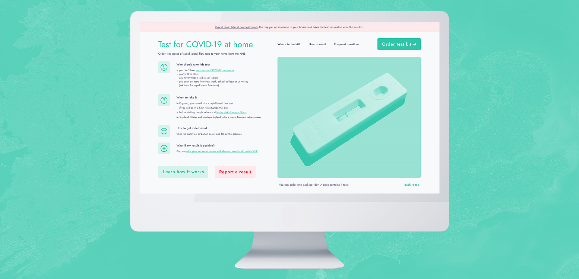
Design a web page for a standalone website to explain how to order COVID-19 rapid lateral flow tests from the United Kingdom’s National Health Service (NHS).
This web page will be for an independent website that wishes to let people know how they can regularly test themselves in order to stop the spread of COVID-19. About 1 in 3 people with COVID-19 do not have symptoms but can still infect others. People can do a rapid test twice a week (every 3 to 4 days) to check if they have the virus.
Reference information (October 2021): NHS Coronavirus Rapid Lateral Flow Tests
Design a visually clear, engaging and informative page that tells the user if the test is right for them, how to get it delivered, what is in the test kit, what if your result is positive, etc.
Anyone older than 11 who does not have symptoms but wishes to regularly test themselves for work, family events or just in general.
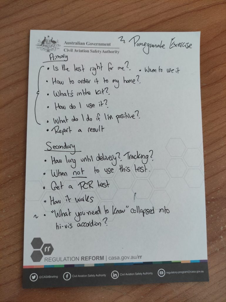
Research focused on understanding two key things.
What should people know before ordering a test pack, and is there any information that needs increased emphasis on the page due to ensure clarity and prevent misunderstanding. How will people be accessing this web page?
What do people expect to find on this web page? What are the most frequently asked questions they’ll have, such as the speed of delivery, reliability of the test, how to use it, what to do if their results are positive etc.

Understand the motivations and situations of the public, rather than attributes and job stories. Focusing on core user needs.

Review current examples of existing COVID-19 test websites, and find exemplars of simple and concise call-to-action interface design patterns.
Jobs-to-be-done (JTBD) is a theory used to define the motivations and situations use a given product or service. It’s written from the end-user’s perspective in the format of “[When____] [I want____] [so I can____]”. “When” refers to the context, “I want to” elaborates on the motivation, and “so I can” refers to the desired outcome.
When I want to test myself for COVID-19 I want to be able to do it quickly so that I can know whether I’m infected as soon as possible and can self-isolate.
When I want to test myself for COVID-19 I want this website to be responsive so that I can access important information and order a COVID-19 test on any device incase I can’t access a desktop computer.
When I am skeptical about COVID-19 rapid lateral flow tests I want answers to my concerns so that I can make an informed decision to use this test before placing an order from the NHS.
When I want to test myself for COVID-19 I want this website to be accessible and easy to use so that I can know important information and place an order regardless of my circumstances (e.g. visual impairment disability, low literacy level, proficiency with technology).
When I want to test myself for COVID-19 I want this website to use plain and simple language so that I can understand how to order and administer a COVID-19 test easily (e.g. avoiding technical terminology, convoluted sentences, large amounts of text/cognitive load).
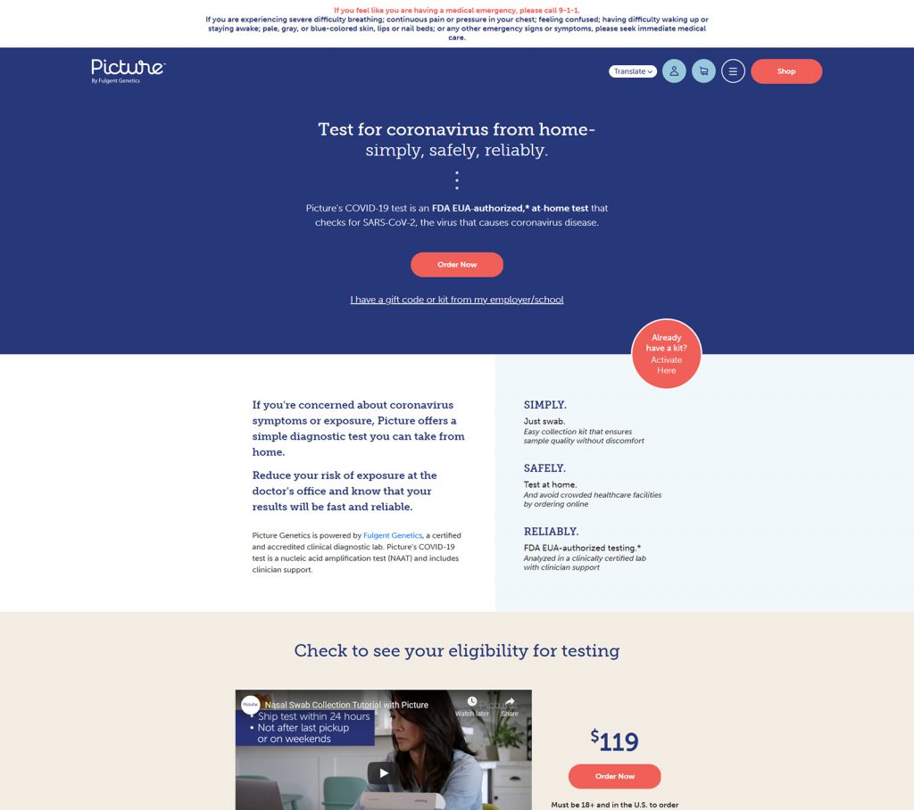
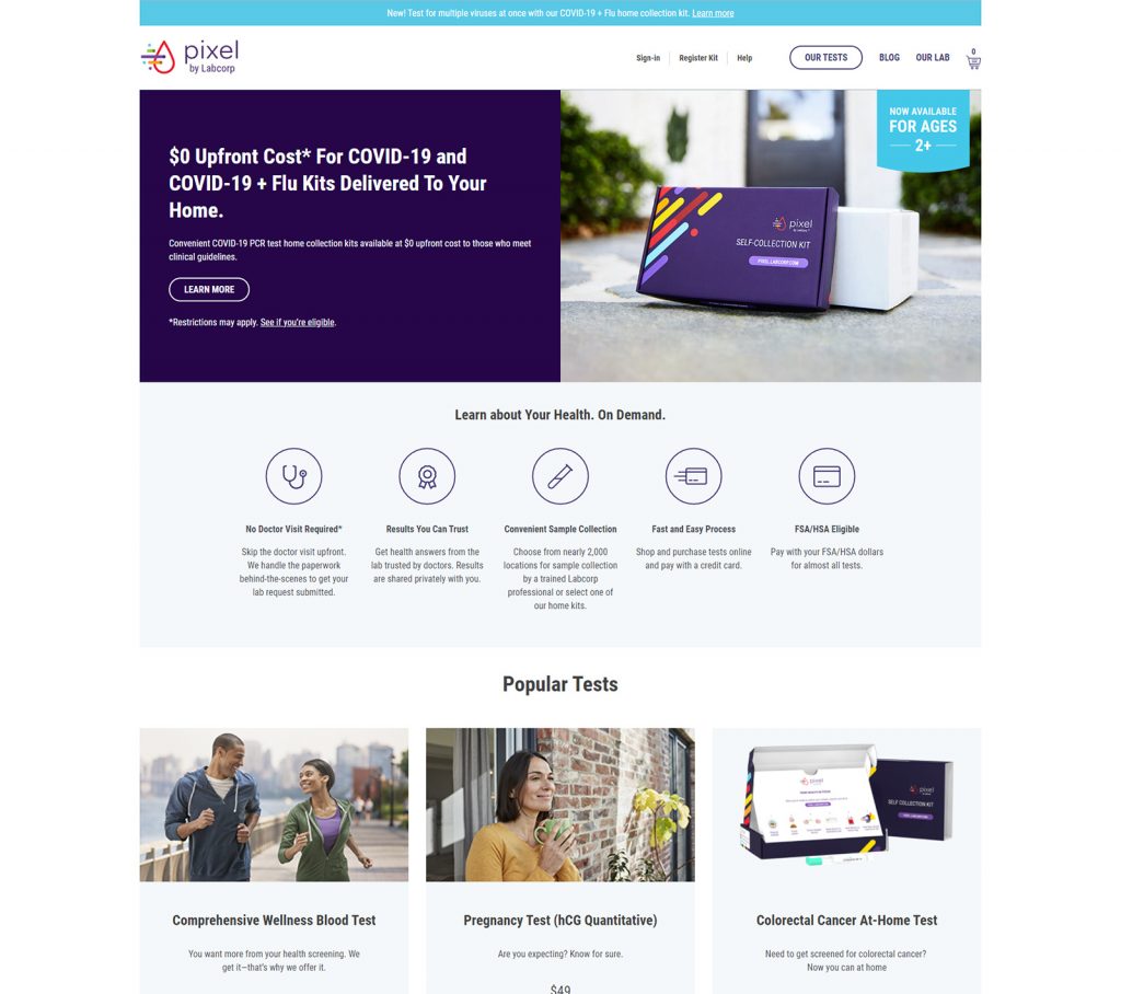
Call-to-action interface design patterns (of varying quality) from a similar context, observed and reviewed based on their intent and execution:

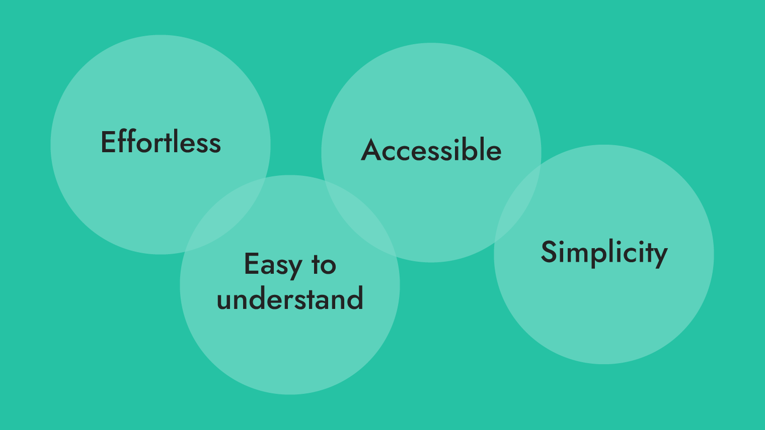
Defining the values that will drive design decisions and ensure a seamless user experience for people across broad and varying demographics.

Considering Jakob Nielsen’s 10 general principles for interaction design, which will serve as “broad rules of thumb and not specific usability guidelines”.
Defining the values that will drive design decisions and ensure a seamless user experience for people across broad and varying demographics:
Make things actions clear and obvious, eliminate the need for users to click or scroll excessively in order to find what they’re looking for.
Keep language simple, display information with a hierarchy in accordance with its importance.
Design with consideration of those with disability, limited proficiency with technology, and provide a consistent and usable experience on any device.
The simplest solution is almost always the best.
Consider how the dimensions of IxD apply when creating prototypes of any fidelity:
Considering Jakob Nielsen’s 10 general principles for interaction design, which will serve as “broad rules of thumb and not specific usability guidelines”. The ones listed below were particularly relevant for this exercise.
Apply thoughtful hierarchy to text and component that keeps provides visibility of important information, and clear paths for users to complete their desired tasks e.g. ordering a COVID-19 test or looking up how to use the test.
Given that this web page is intended for broad demographics, saying things simply and plainly is a way to assure content will be understood by everyone.
Provide clear navigation, and contextual cues for where they are on the website.
Use of language, actionable components such as buttons and links, and the design as a whole are consistent and in adherence with good practice.
Reduce cognitive load by displaying information when its relevant, avoid walls of text etc.
If the most frequent action on the web page is to be directed to order a COVID-19 test, then ensuring that action isn’t buried is an example of efficient design.
Less is more. Avoid interface design with competing elements and conflicting hierarchy.
When needed, provide context to help people complete their desired task.
Quickly sketching three distinct ideas in the span of 8 minutes, pushing past the least innovative idea (usually the first) to refine a solution to the design problem.
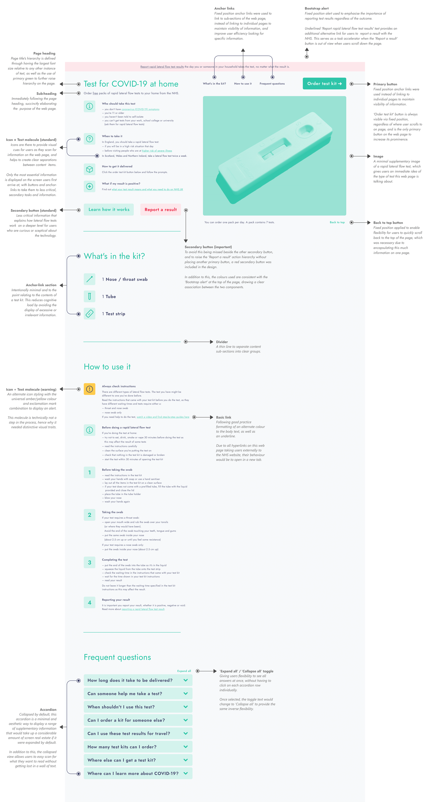
I reviewed the paper prototypes, which served as a useful (albeit quick and messy) visual aid for figuring out the structure of the landing screen, layout and hierarchy of the web page. Although the sketches were very low fidelity, annotating them to further define properties such as heading levels, primary and secondary buttons allowed me to work quickly with a strong foundation in the later stage of prototyping.
Determining the hierarchy and importance of information was based on the brief I was provided, the jobs-to-be-done I formulated when thinking of the wide array of people who would access this information, and review of the existing Order coronavirus (COVID-19) rapid lateral flow tests web page on GOV.UK; although it displays comprehensive information, it was overwhelming to process and took time to categorise information I assumed was essential to know and what was supplementary.
These open-ended assumptions are why it was so essential to define the guiding principles earlier before moving forward with a high-fidelity design.
This desktop prototype provides high-level visibility of the most essential information first, before giving users a linear flow to discover supplementary information.
Everything was designed whilst considering usability, striving for a minimalist and simple approach that reduces the number of user interactions needed to get to the information they’re looking for.
I found it fascinating that this brief was based upon a UK Government web page that was built in adherence with the GOV.UK Service Manual and Design System, and that despite meeting these standards for consistent design, accessibility and usability, the web page still missed the mark at making this information easy to process for everyday people.
A key takeaway I saw was that it’s one thing to check boxes and say something meets business and design requirements, and it’s an entirely different matter to look at the end-product as a whole, in an objective way and be able to see its flaws.
A project can miss its mark if generic guidance is followed too prescriptively, which is why it’s so important to constantly challenge our personal biases and lack of perspective, irrespective of field or discipline.
Focus: User Research, Interaction Design, Interface Design
Client: Private individual (Freelance)
Focus: User Research, Interaction Design
Client: Australian Department of Defence